Quest Software - Showcasing customer use cases.
Background
Quest Software is a B2B business that creates software primarily for Database Administrators. As a Senior Graphic Designer, I am often tasked with designing solutions to improve web pages, templates, collateral and event assets, and more. For this project I was asked to create the case study template for the web.
Brief
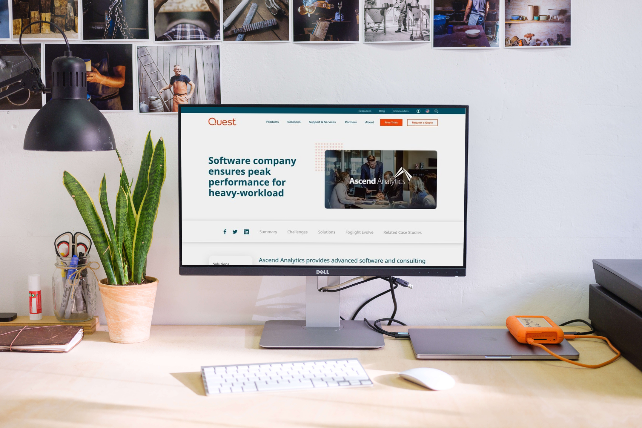
Previously, the site had a short preview and quote which linked out to case studies in pdf format which the readers could download. The goal was to establish a complete web experience which could link out to products, solutions, and related case studies.
Pain Points
There were several issues with the previous model including:
Bad SEO optimization
The need for customers to download, an additional barrier
To not have a direct link to our solutions or products, which increased the bounce rate and decreased conversion
The need to update pdf’s frequently
Research
Some of the research tools I used on this project were discussions with the PMMs and Dev team as well as researching competitor pages.
Process
After several meetings with my own team and the Dev team we determined the optimal layout for content: a short preview on top with customer information, our products and solutions used and a link to the pdf —allowing customers that prefer the old experience to still enjoy it. Following down the page, we staggered text, images and quotes with some of our brand’s graphical elements to guide the reader down the page where we had our CTAs, Resources and additional information.
Challenges and Solutions
One of the challenges of this project was to ensure we could retrofit old case studies as well as support creating new ones in this new style. In my initial draft, I had full length imagery as hero images, tags, and standard logo sections. Due to the lack of consistency in previous and current photography, the anonymity of some of our clients, and the limitations of our system we were unable to implement these respectively.
We also implemented one of my recent favorite solves - an in-page navigation to allow a fluid way to be guided through the page.
Results
Through the implementation, case study readership increased, SEO was further optimized and the bounce rate decreased. Due to the nature of how our software sales work it is hard to tell if there was a direct effect on conversion, but I would find it hard to believe as awareness and trust grows through readership of case studies that it wouldn’t have a marked impact.
Reflection
I learned in this project tablet and mobile views increased scrolling dramatically, but since scrolling is so standardized on those platforms it doesn’t make a huge difference on staying power.
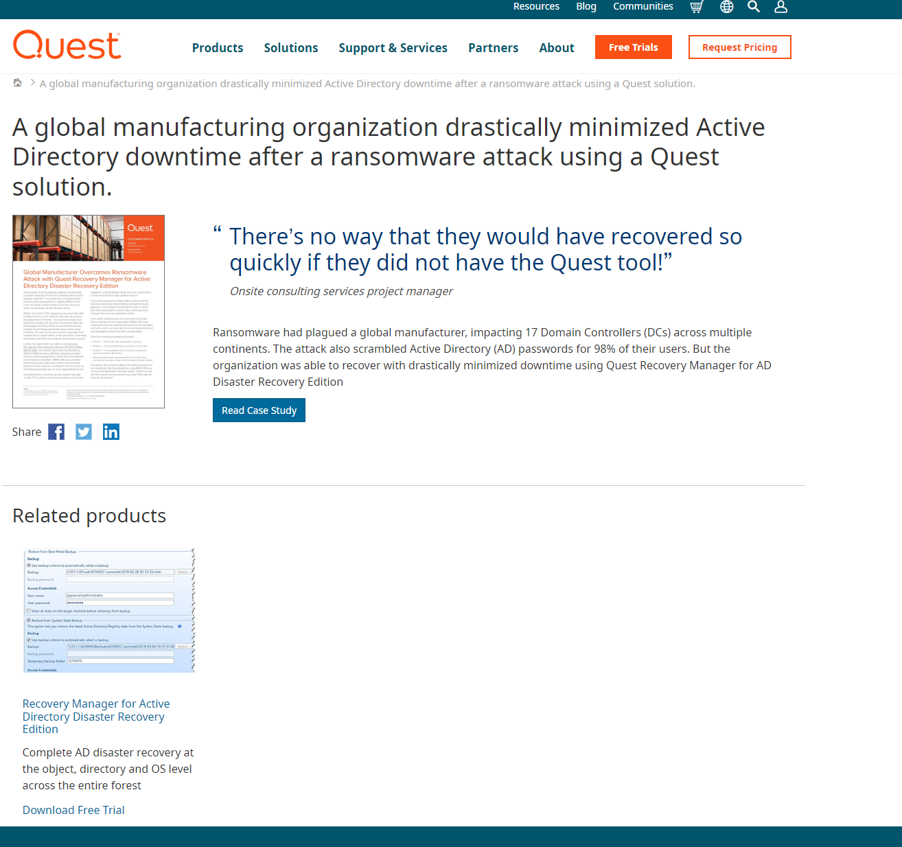
Previous case study experience
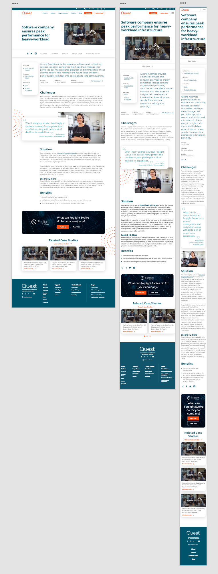
New Case Study template, with responsive views
Conclusion
In this redesign I sought to improve our customer experience through making our customer case studies accessible and to be part of the consideration step in customer conversion. Through the metrics we measured it was a resounding success.