
Amazon - Reinventing one of the world’s most used shopping experiences.
Background
One of the most ubiquitous names in online shopping in America has an issue — well, several really. Since around 2005 the brand hasn’t updated much, and likely for good reason. “If it ain’t broke, don’t fix it” the old adage goes, and it seems to have pulled them through many successful years. In my research and design process, I have explored several ways to evolve the look and user experience. For the sake of practicality I limited my scope to the Product Listing and Product Detail pages.
Pain Points
Some of the app’s most glaring issues are:
Lack of focus - The current experience doesn’t respect customer’s time or attention. There isn’t a ton of distinction in dominant or subdominant elements on the page, and to be frank it’s a cluttered mess.
Lack of enjoyment - It’s not even necessarily easy to use- making the user goal to leave asap rather than browse - which could be a goal, but flies in the face of traditional design goals.
Dated visual elements - Refresh the branded elements, buttons and interactions into this decade. Increase the whitespace without compromising on amount of content or length of the scroll. Keep the site easy to use and familiar enough for current users.
Research
Some of the research tools I used in reworking my design were articles, user interviews, and my own experience as a customer as a supporting source.
Prototyping and Testing
My initial sketches erred towards the goal of clarity. I removed features that didn’t add user value and wanted to add functionality to simplify and streamline a buyer’s typical flow.
Challenges and Solutions
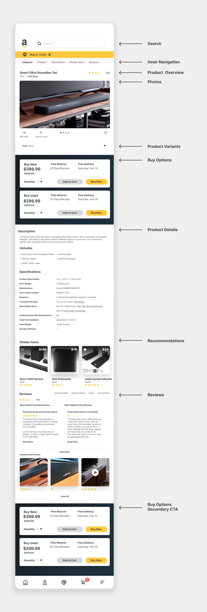
Moving onto the low fidelity sketch phase I encountered a few issues. I realized the importance in separating the brand and item name, allowing users to like an item to look back at it later without leaving the screen, and added an in-page navigation in the product page to reduce scrolling unnecessarily, I also grouped sections together in the product details page to allow for more compartmentalization and less mental work in scrolling. In addition, I added filters to the product listing page, allowing users to get where they want to go more directly.
Visually, some of the issues I ran into were inconsistency with rounded edges, buttons, colors and card based vs flat design. I also replaced the orange with a vibrant yellow (FFC93D) and the dark color with the prime dark gradient - an existing color that is underutilized by the brand. I also removed the outline on a lot of elements, one of the more dated choices.
Some of the things I liked and kept were the bottom bar, the zip code confirmation - handy device to ensure you are on the right track, and the swipe function in certain sections.
My favorite feature I added was the inner navigation on the product detail page— on the current page, it is quite daunting to find the information you are seeking.
Results
Though I didn’t have the ability to implement and test certain features properly, I would test the success of the design via the Nielsen Heuristics:
Visibility of System Status
Match Between System and the Real World
User Control and Freedom
Consistency and Standards
Error Prevention
Recognition Rather than Recall
Flexibility & Efficiency of Use
Aesthetic and Minimalist Design
Help Users Recover from Errors
Help and Documentation
Reflection
A big learning from exploring this is how quickly scope grows when redesigning a big project with lots of edge cases like this. Even with simple feature changes or additions, the amount of screens and overlays needed to be designed were numerous.
Areas for improvement
The project could probably be improved in hindsight by conducting further interviews and if time allowed, watch how more users interact with the pages. Personal experience and anecdotal research is always biased to some point.
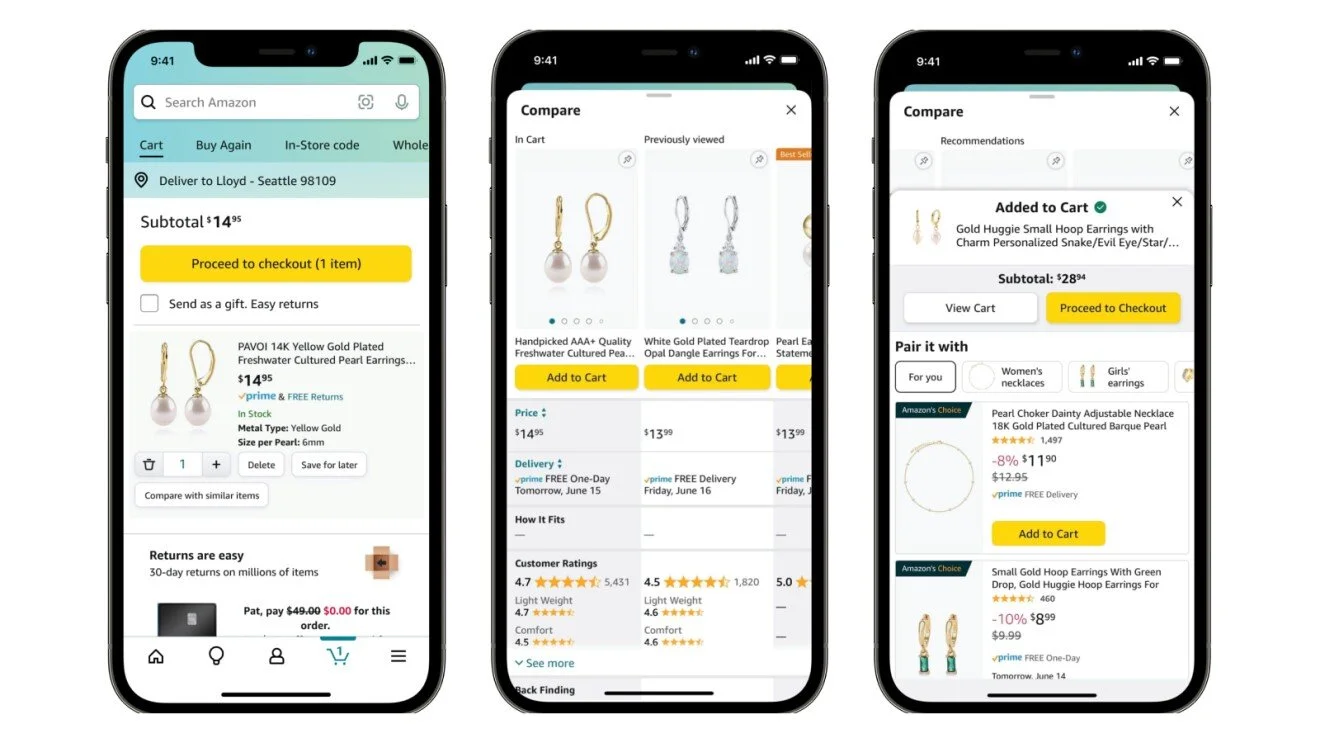
Current Amazon Screens
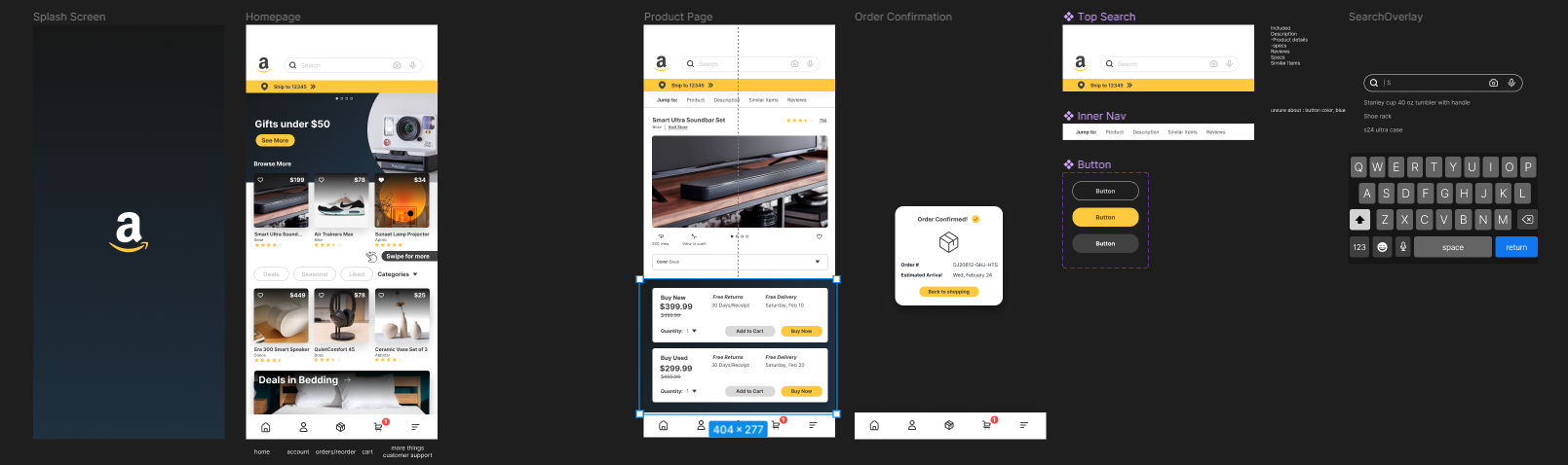
Some Figma Screens and Overlays

Product Detail Page Mockup
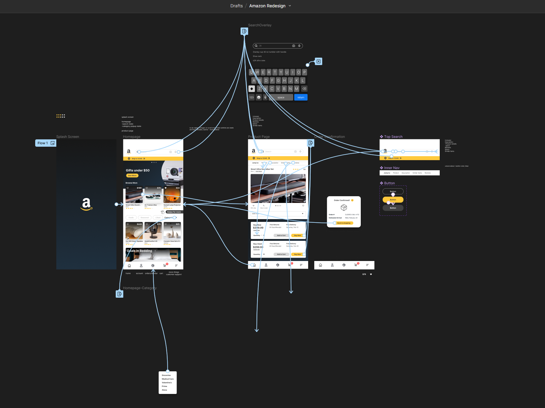
Prototype view in Figma
Product Detail Page Walkthrough
Conclusion
In this redesign I sought to modernize, simplify and evolve the design of the current amazon buyer experience. By increasing whitespace, reducing taps needed to get to the goal, and ensuring proper categorization I think I succeeded. Below you can see my final prototype.
